Tuesday, 19 December 2017
Sunday, 3 December 2017
Production: Listening to audience feedback

These are two comments from my audience feedback on my products that suggested some changes for my digipack. I have decided to take on board their criticism and try what they have suggested.
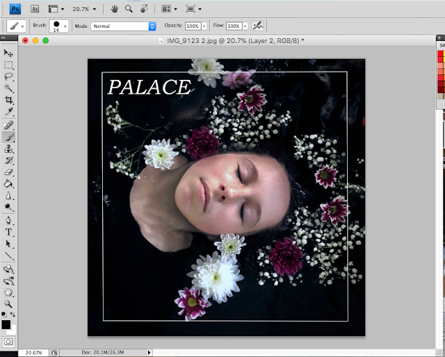
Here is a mock-up of the image with a smokey background as suggested by one of the comments. I have also changed the Palace font and made it bigger. I do not like this image for an album cover, I think it looks too plain and not as effective as the previous image that I used. It does relate to my music video better, however, I think that this is more of an issue than a positive thing as all but one of the of the existing products that I have analyzed do not have a concrete connection between the music video and the digipack. In fact, many of the products are very different from each other and have little if no connection (see blog post about alt Js music video and brand analysis) between the music video and the digipack. The digipack and music video often use the same font or similar themes but do not explicitly link. However, I understand that for the purpose of this project the digipack and music video must have a noticeable connection. This is why I chose to have the subject of my music video on the front cover and use the same pool that features heavily in the video, just with some slightly different elements such as the flowers.

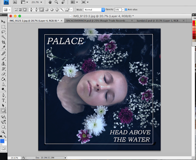
This is my previous image with a different and larger font. I much prefer this to the other mockup image. The bigger font is much clearer and somewhat more sophisticated and modern than the last font that I had chosen. I think that the image is much stronger and still has links with the other products such as the music video whilst still adhering to conventions of not relating the two products as much.

I have also added lyrics of Head above the Water on the inside cover of the digipack. This was suggested by one of the responses to my audience feedback.
After completing these changes I created a questionnaire to ask my audience if they liked the changes that I had made. Below is the feedback from my final audience feedback. The first question is a response to my final digi pack design, which I have changed since the last feedback to include 6 panels and I have included song lyrics over one of the panels as suggested. the second question asked the audience if they preferred the album cover with the flowers or the smoke.
The third question is a response to the new font that i have used and increasing the size of the font.


This question asked the audienec which album cover they preferred.They unanimously picked the one with the flowers.

Finally, the audience seemed to like the more modern font more.
Research: mass audience feedback questionnaire responses


These are the responses to the first question of my questionnaire they all successfully identify the genre of 'indie' correctly which suggests that I have correctly adhered to genre conventions. Most of the responses also picked out the similarities to the video "Break the Silence". For example, the cool tones, low angles, use of female subject for narrative, focus on guitar and woodland location. The responses were positive and what I had hoped for.


These are the response to the editing of my video. The response was mostly positive and people thought that the editing was professional looking. Some people thought the pace of editing was a bit too slow but I am not going to alter the pace editing because I think the fact that it is slow adds to the moody atmosphere and it helps focus the audience on some of the more artistic shots.


These questions were about the aesthetic of my video. The responses were positive and I think that I have been able to create a strong aesthetic. I think this is partly due to using tools such as a mood board to help me create a clear image from the beginning of production.


These questions focus on my digipack. The responses seemed to suggest that they liked my digipack although not all of them were familiar with digipacks from the indie genre. Most people picked up on the color scheme and natural aesthetic and smoke motif. Two out of 19 responses were negative and said they were not sure about the flowers. I will be addressing this in a later post.


These questions focus on my album advert. The response was mostly positive. Some suggesting putting the price of the alum on the advert, however, this was not seen on any of the adverts that I analyzed previously and so I do not believe that it would be conventional for my genre. One comment suggested putting a quote from a review of the album. I am not going to do this however as I would like to try and keep my advert as minimalistic as possible to focus the audience's attention on the album art. I will address some of the other comments in a separate post.

Finally, i asked my audience if they would change anything about my digipack. Most people said no but others suggested 6 panels. This is something that I will be doing. someone also suggested writing on the top right image, I think I will try this out and see what it looks like.
Production: twitter account
Twitter account
I have created a twitter account for my band, in order to promote the album and music video and to interact with the digitally native target audience. Some of the tweets that I have published include a tweet about palace performing on RadioX. RadioX is a London based radio station that plays indie and rock music, I think that this radio station would be an appropriate station to promote my band as they would have the same target audience as my band. As well as this I have included a poster for truck festival, as this is a small indie music festival in the south-east of England. This would also fit the target audience of my product.


Friday, 24 November 2017
Production: product in digi pack template
Tuesday, 14 November 2017
Production: magazine advert for digi pack

This is the first draft of my album poster. I have tried to emulate the products that I have studied by including star reviews, website links, and social media links. I have also tried to keep the poster fairly simple so I do not draw attention away from the album artwork. this is also a convention of the indie album posters that I have looked at (such as the horrors). I have also used a thin white line around the edge of the poster. This is inspired by the alt j relaxer album poster.
Monday, 13 November 2017
Production: album cover editing


I have started editing my album cover photos in photoshop. I have used the clone tool to add more flowers around the model's neck and face as there was not enough. I have also added a white border as I have done on my back cover. I have used the same font as the back cover and the CD and I have added a blue filter in order to keep the theme of the blue tint running through my work, however, I am not sure if I am going to keep this or not.
Production: album cover photos


These are the photos that I have taken for my album cover. The photos have been inspired by the photo Ophelia, however not as much as I would have liked. I did intend for my model to wear a white flowing dress to add to the pre raphelite influence however on the day of the shoot she forgot to bring it with her so we ended up using a plain black top so not attention was taken away from her face or the flowers. I think that this was still effective. The last two individual photos are the ones I have I decided to use, I have turned down the warmth of the photo and cropped it to fit my album cover size and shape. I think these photos fit the title of the album "head above the water" well.
Planning: flat plan magazine advert for digi pack

This is a flat plan that I have done for my album poster I have planned to include conventions such as a website, reviews, the name of the album and the name of the band, I have planned for the main image to be the same image as the front cover of my digi pack to create a sense of continutiy between the products.
Planning: Digi pack Flat plan

This is my flat plan for my digipack. I have drawn a six-panel template, however, I am still unsure whether to do four or six panels as I do not know which is more conventional. I ahve included many conventional features such as space for track listing on the back cover, images of the band on the inside cover and a minimalist front cover. I have also included a wave motif/logo on the CD itself.
Friday, 10 November 2017
Production: DigiPack back cover draft

This is a draft of a back cover for my digipack. I have included the licensing and distribution rights, record label and barcode at the bottom of the cover to adhere to digipack conventions in order to make my product look as realistic as possible. I am please with this draft and if i do not take any better photos (when I do a shoot for my front cover) then I am considering using this draft for my Product.
Wednesday, 8 November 2017
Production: CD first draft


This is a draft for the CD itself, I have included the record label at the top of the record as well as a copyright symbol. This is a common convention of CDs as i have seen on the above Alt-j CD (top right image). I have used a white italic serif similar to that of the font used on Alt j's album relaxer. Below this I have drawn a simple white wave symbol which is going to be the symbol of the album. The image used on the CD is a blue/green marbel effect which works well with the aesthtic of the album. I have tried to emulate how the CD for relaxer (top left) works with the aesthetic of the rest of the alubm (middle) .
Subscribe to:
Comments (Atom)
Brief
Choosing a Brief 1. A promotion package for the release of an album, to include a music promo video, together with two of the follo...
-
Summary of conventions of existing music videos From my research I found that some of the conventions of existing indie music videos in...
-
These are the responses to the first question of my questionnaire they all successfully identify the genre of 'indie' correctly w...


