Friday, 24 November 2017

Production: product in digi pack template


This is an image of my digi pack in the correct template. This follows the conventions of a digi pack and I have changed the orentation of the image in order to follow the correct digi pack lay out.

Tuesday, 14 November 2017

Production: magazine advert for digi pack


This is the first draft of my album poster. I have tried to emulate the products that I have studied by including star reviews, website links, and social media links. I have also tried to keep the poster fairly simple so I do not draw attention away from the album artwork. this is also a convention of the indie album posters that I have looked at (such as the horrors). I have also used a thin white line around the edge of the poster. This is inspired by the alt j relaxer album poster.

Monday, 13 November 2017

Production: initial designs for digi pack

Production: album cover editing


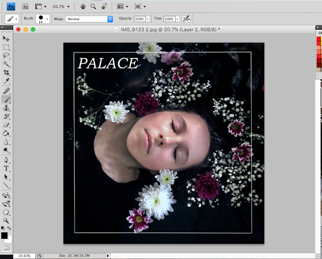
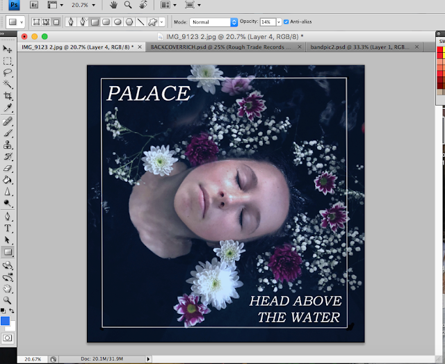
I have started editing my album cover photos in photoshop. I have used the clone tool to add more flowers around the model's neck and face as there was not enough. I have also added a white border as I have done on my back cover. I have used the same font as the back cover and the CD and I have added a blue filter in order to keep the theme of the blue tint running through my work, however, I am not sure if I am going to keep this or not.

Production: album cover photos


These are the photos that I have taken for my album cover. The photos have been inspired by the photo Ophelia, however not as much as I would have liked. I did intend for my model to wear a white flowing dress to add to the pre raphelite influence however on the day of the shoot she forgot to bring it with her so we ended up using a plain black top so not attention was taken away from her face or the flowers. I think that this was still effective. The last two individual photos are the ones I have I decided to use, I have turned down the warmth of the photo and cropped it to fit my album cover size and shape. I think these photos fit the title of the album "head above the water" well.

Planning: flat plan magazine advert for digi pack


This is a flat plan that I have done for my album poster I have planned to include conventions such as a website, reviews, the name of the album and the name of the band, I have planned for the main image to be the same image as the front cover of my digi pack to create a sense of continutiy between the products.


Planning: Digi pack Flat plan


This is my flat plan for my digipack. I have drawn a six-panel template, however, I am still unsure whether to do four or six panels as I do not know which is more conventional. I ahve included many conventional features such as space for track listing on the back cover, images of the band on the inside cover and a minimalist front cover. I have also included a wave motif/logo on the CD itself.

Friday, 10 November 2017

Production: DigiPack back cover draft


This is a draft of a back cover for my digipack. I have included the licensing and distribution rights, record label and barcode at the bottom of the cover to adhere to digipack conventions in order to make my product look as realistic as possible. I am please with this draft and if i do not take any better photos (when I do a shoot for my front cover) then I am considering using this draft for my Product.

Wednesday, 8 November 2017

Production: CD first draft


This is a draft for the CD itself, I have included the record label at the top of the record as well as a copyright symbol. This is a common convention of CDs as i have seen on the above Alt-j CD (top right image). I have used a white italic serif similar to that of the font used on Alt j's album relaxer. Below this I have drawn a simple white wave symbol which is going to be the symbol of the album. The image used on the CD is a blue/green marbel effect which works well with the aesthtic of the album. I have tried to emulate how the CD for relaxer (top left) works with the aesthetic of the rest of the alubm (middle) .

Research: focus group questionnaire feed back

here is a link to my questionnaire 


This is the feedback from my focus group questionnaire. All of my focus group believe that my products are genre-appropriate and would appeal to the 16-25 indie target audience. I am very pleased with this feed back. I am also pleased with the feedback fo the band image I am planning to use for my digipack inside cover. My focus group said it adhered to conventions and that established the mis en scene, they also liked the symmetry and colour of the photo. The feedback for my marble image is more inconclusive as it is 50/50 but I think that I am going to use the image for the cd inside cover.


Tuesday, 7 November 2017

Research: Looking at which magazine would be best to market my album

Research into what magazine my band's album would be advertised in 

These are statistics from possible magazines to advertise my album. these statistics will help me understand theri audinenec and decide whether it matches the audience of my own band. 

CLASH magazine demographics and statistics: The audience is very young and often visit music venues. The gender of the magazine is quite evenly split and this is something that I would expect the audience of my band to be. 


NME: the readers of nme are young and use social media often however they do not have an equal gender split (63% male) which I think that the audience of my band would have a fairly equal gender split. For this reason, I think that CLASH would be more appropriate for my band. 


Research: looking at articles on how important music videos are

https://medium.com/@pulsefilms/why-music-videos-are-still-so-important-views-from-inside-the-industry-ebaa7d4758d2

link to the article 

Even if everything is now digital, who doesn’t want to have more than just the track…I would say the track is the burger and the music video is the full meal deal with fries and Coke” — Simon Cahn
This article is about how with today's technology-obsessed world, music videos are more important than ever. In fact, it could even be seen as more important than the physical album cover artwork. "We used to buy a physical album with nice cover design, but now we consume on a plethora of platforms. Can you remember the artwork of the last track you heard? I can’t. But I CAN remember the video. It’s like a digital CD case for the track." Youtube is the second biggest search engine after Google and music videos have become both easier to create and upload as well as watch, creating a younger generation of filmmakers. Music videos help to create icons and amplify star image, for example, Miley Cyrus and her "wrecking ball" and Pharell Williams and his hat.

Research: How much money is made through streaming sites


https://www.economist.com/blogs/prospero/2016/02/music-industry This is a link to an article about the death of the full-length album but how through streaming sites such as Spotify albums are still making money even for small indie bands such as my band (palace).

"Spotify suggests that albums are still worth artists’ while on a fiscal level, even though they pay rights holders a seemingly measly sum of $0.006 and $0.0084 per stream. In 2013, they estimated that monthly royalties for a niche indie album were more than $3,000, $17,000 for a rock album, and $145,000 for a top-ten album. Global breakthrough albums could reap around $400,000."

research: sending a questionnaire about my products to my target audience

this is a link to my questionnaire

I have made a questionnaire for my focus group so I have an idea of what they are thinking about my product and what images I should use for each part of my ancillary product as I am still unsure and I think their input will be very helpful.

Monday, 6 November 2017

Planning: image for actual cd


Instead of using this marbled ink image as a front cover I have decided to use it as the print that will appear on the actual cd its self as I think that it is too simplistic to be used as a cover and will be more effective on the cd. I will also use the small wave motif. I will not be using the font that is present on the image. I am still unsure of this choice however and will be asking my target audience about it through the use of a questionnaire.

Planning: planning my front cover image.

I am thinking of using the same girl as in my music video for my front cover image. I am also going to use the same pool and location. I would like to base my image off of the famous pre raphealite painting Ophelia. The shot will be an aerial close-up shot of the girls face with her eyes closed and flowers dotted around her head. I will dress her in black or white clothing spread her hair out in the water. I will also make sure that the image is blue toned in order to keep the strong sense of brand identity.


Sunday, 5 November 2017

PRODUCT: draft 2 of music video

head above the water from Katie Faint on Vimeo.


This is the second draft of my music video. I have taken on board some of the advice given to me from my audience feed back. I have included shots of the girl walking in the woods at the very beginning of the video (0:10s) in order to create more of a narrative and introduce the character more slowly. The fact that she is walking helps to create a build up of tension as later on in the video as the tempo of the music speeds up she is seen to be running. I have also attempted to do this by adding a close up shot of the girl swimming underwater so the audience are introduced to the underwater narrative earlier on. The fact that she is swimming at the beginning of the video suggests to the audience that she is still afloat and coping with her struggles. I have also lengthened the shot of the girl swimming (2:05m). I did this after getting a comment on my first draft that was posted on my Vimeo account which advised me to do so. I have also cut a minute off of the end of the video. I have done this because I felt that the song did not develop much past this point and the the video was more effective in its shorter form.


Thursday, 2 November 2017

Planning: images of the band for my digi pack


These are some images of the band that I have taken on the same day as my music video shoot and so have a similar aesthetic and to the video. I am going to use the bottom image on the inside cover of my digi pack as I would like to stick to the codes and conventions of the albums that I have analysed and use some more creative artwork or photography from my front cover. I like the composition of this image and the framing of the lead singer of the band due to the skip in the background. I also like how this image is fairly symmetrical. I have added some sky at the top of the image in photoshop but this requires a lot more work in order to make it look more natural. I have done this is the image will be able to be cropped into a square later on so it will be able to fit into the digipack properly.


This is an image that I may use for the back cover of my digipack. I have used the lead singer of my band to make sure the focus is not taken off him and to some extent adheres to Dyer's star theory, I have also used a blue smoke grenade in order to create a link between my music video and the album. I have taken these images on a different day to my photo shoot but I really like the look of the smoke in the woods and I think it will still look effective with text over the top. I have also taken this photo with a different camera without a temperature setting so have had to adjust the colour in photoshop.

Research: conventions identified from researching magazine advert for digipacks


These are all indie album adverts. All of the artists thats have produced these posters have a similar representation to my own band and all bar one have used album artwork on their adverts instead of images of the band or artist. 


From my research I found that some of the conventions of existing indie band posters include:


  • Using album art on an album advert is a convention of the indie genre and not so much of other genres like pop or grime which usually focus on the artists themselves and adhere to richard dyers star image theory. 
  • All of these posters follow the generic conventions of having the artist name in large bold font that is easy to see and this is often in the bands signature font.This helps create a sense of brand identity and helps the product work well across various media platforms.
  •  The arists name is usually the largest font on the poster, followed by the name of the album, as is seen on these posters. This is so the audince will see and remember the name of the album and band.

  •   all of the posters have a link to website on them, to help their digitally naitive target audince engage with the products.
  • The posters also inclued the words "out now" in bold lettering, this is a convention of music posters of all genres and incourages the target audience to go and buy the product. 
I will adopt  all of these conventions within my own work. 

Research: Ancillary products the horrors skying album advert


Research: textual analysis of Bombay Bicycle Club album advert


Research: textual analysis of courtney barnett magazine advert for a digi pack

Wednesday, 1 November 2017

Production: taking more photos for my ancillary products


I have gone out and taken some more images of my ancillary products using the lead singer of my band and a blue smoke grenade. I am thinking of using one of these for my back cover after some colour correction and adjustment in photoshop.

Brief

Choosing a Brief 1. A promotion package for the release of an album, to include a music promo video, together with two of the follo...