Friday, 29 September 2017

Research: audience feed back on first draft

Below is some feedback from my target audience on my first draft of my music video. The first comment is from the video that I posted on Vimeo. Most of the people liked my video but said that I should try and create slightly more of a narrative by putting shots of the girl in earlier in the video. The comment on Vimeo says that I should lengthen one of my shots. I also contacted my focus group ask about the length of my video as i was concerned it was too long. Charlie answered my message and he said that he thought the video was too long. I agree with all of this feedback and I will aim to incorporate these suggestions in my 2nd draft of my video.

Wednesday, 27 September 2017

Production: first draft of video

head above the water from Katie Faint on Vimeo.

This is a link to the first draft of my music video. I have posted it on Vimeo and I have asked my peers and focus group to watch it and comment on what they think about it. This feed back will help me to see what I need to change and what my focus group like.

In this first draft of my video I have used many different shots from my four different locations and I am very pleased with the way that the footage has come out. I am glad that I listened to advice to film more footage than I may have initially thought I needed as I do not think that I need to go back and re-film and I have many different camera angels that I can use.

I think that the narrative of the video may need to be made a bit stronger by moving some footage around. As well as this I need to see what my target audience think of my video and how they think that I could be improved but overall I am pleased with my first draft and the quality of my footage.


Tuesday, 26 September 2017

Production; editing my music video


Today I have been editing the smoke section of my music video. This has been challenging as I do not want two very similar shots to be right next to one another because it can make the pace of editing seem quite slow. I have also had to stabilize many of these shots as I was running or moving about when I took them. I am very pleased with the effect that has been created however

Sunday, 24 September 2017

Research: conventions identified from magazine adverts for digi packs


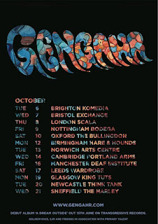
These are band posters all from the indie/indie pop genre. All of the posters apart from the ones for Chelou and Courtney Barnett use the album artwork in their posters and do not feature the band/artist themselves. Using album art on a tour poster is a convention of the indie genre and not so much of other genres like pop or grim which usually focus on the artists themselves and adhere to richard dyers star image theory. All of these posters follow the generic conventions of having the artist name in large bold font that is easy to see and this is often in the bands signature font. This helps create a sense of brand identity and helps the product work well across various media platforms. The posters  also all have the date/dates of a performance or multiple tour destinations. Another convention is that they all have a small website address at the bottom of the poster, either directing the audience to a ticket website or the bands own website. As well as this some of the posters have the price of the tickets on them.

Elements of the posters that I would like to try myself 
I really like how the gengahr poster uses a font which has been cut out from the bands album art work I think this maybe something that I would like to try in my own work however this is a skill that I would need to learn how to do in photoshop or InDesign. If this style does not look as visually pleasing as expected then I would like to try running the name of the band vertically as is done on the Courtney Barnett poster. This challenges conventions of most band posters but  think it looks very effective and would be appropriate for the genre. However I will also follow many of the generic conventions of a band poster such as having the date, price of tickets, website and venue on my poster.

Production: Editing footage


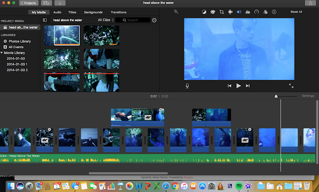
Today I have begun editing my music video in iMovie, I have decided to use a repetitive pattern comprised of Ariel shots of water and close-ups of smoke to introduce the themes of the video. I then decided to use shots of the forest and introduce the main character of the narrative. I have also chosen a sleek modern white font to display the text "head above the water". I will use a font similar to this across all of my products to create sense of brand identity.

Saturday, 23 September 2017

Research: conventions of indie music videos identified from analysis

Summary of conventions of existing music videos

From my research I found that some of the conventions of existing indie music videos include:
  • ·      A wide range of shot types and camera angles to keep the audience engaged and make the video more visually pleasing. – all videos analysed
 
screen shot from chained music video
s
  • ·      Close ups of the lead singer lip syncing and close ups of the band playing their instruments. This is to represent the star of the music video. – all clips analysedveins  music video

  • ·      Editing of the song in time to the beats of the song (thought beats theory). This makes the song connect to the visuals in a more gratifying way for the audience – all clips analysed

  • ·      Band are dressed in dark clothing typical of the indie genre e.g. band t shirts, plaid tops, DM boots. This is so that the band can be identified as indie and so the indie target audience can receive a sense of gratification as they identify with what the band are wearing. – all clips analysed


  • ·      Dark lighting/ moody atmosphere. This helps to amplify the lyrics of the song. – break the silence music video

Breeze blocks music video 

  • ·      Low production value so cheap sets, this is because indie bands have a niche audience and not aimed at the mass market and so do not make as much revenue therefore reducing production value. set often in woods or somewhere natural - break the silence music video, veins music video, chained music video
break the silence

  • ·      Combination of band performance and Loose narrative- all clips analysed apart from I Can’t See music video


I will incorporate all of these conventions into my own work in order to make my work as professional looking as possible.

Production: Video clips from filming


These are some of my favourite clips from filming. They are some shots from the pool and I think that they look very effective and will work well with the lyrics of the song "head above the water"

Thursday, 21 September 2017

Research: Deadcrush Music Video Textual Analysis


Deadcrush 
link to video 

Institution
Alt J are a four piece indie band from Leeds who signed with Infectious records in 2011. They have released 3 albums, An Awesome Wave  (2012), This is all yours (2014) and Relaxer (2017). The band have become increasingly successful in the last few years and have had a heavy touring schedule and this has lead to the departure of bassist Gwil Sainsbury. The remaining members are lead singer and guitarist Joe Newman, drummer Thom Green and guitarist Gus Unger-Hamilton. They have won awards such as the Mercury Prize (for an awesome wave) and they have had three Brit Award nominations.
Infectious records was established in 1993 by Korda Marshall and is located in London. The parent company of Infectious records is BMG Rights Management, an international music company specialising in music distribution and publishing. BMG rights management was established in 2008. Since 2009, infectious records have signed many emerging indie bands such as Alt J, Superfood, Drenge, the Sherlocks and Vance Joy.

Audience
The primary target audience of this video would be both men and women aged 15-30 that are interested in indie music and pop music and maybe some forms of electronica. The audience for this specific video also may have an interest in art and science fi cinema due to the confusing but artistic nature of the video and sci fi aesthetic. 

Narrative 
The video does not have a strong narrative but it does have a story of some description behind it . The story is not immediately clear to the audience and is some what convoluted but the video does have some meaning. It is based around each of the band members dead crushes: Sylvia Plath, Anne Boleyn and Lee Miller. A collection of small glass circles and a projector make up a super computer that brings each of these characters into existence at the same time. The idea of the ultra modern super computer and sci fi aesthetic in contrast to the historical figures (dead crushes)  links to Sven E Carlsons Binary Oppositions theory that binary opposites help to drive a narrative. In this case the past and the future. There is  some development through out the video but this is unlike the development of a strong narrative story that would be present in a silent film like Narrative Clip (Sven E Carlson). 

Editing 
The video is edited in time to the beats of the song and this adheres to Andrew Goodwin’s theory that there is a connection between the visuals and the beats of the song and the idea of ‘thought beats’ and seeing the sound. The editing does not completely fit with all the beats to the song however. As a whole the pace of editing throughout the video is fairly slow. This draws more attention to the artfully shot videos and would appeal to the target audience.


Research: Semiotics and Ferdinand de sassure

Semiotics and Ferdinand de sassure

Ferdinand de sassure was one of the founding fathers of semiotics and semiology in the 1800s. Semiotics is the study of signs as part of social life. The signification of some thing is broken down into two aspects: The signifier, which is the form that the sign takes and the signified, which is the concept that it represents. “The sign is the whole that results from the association of the signifier with the signified.”- Sassure. An example of this is the word “closed” on a sign outside a shop. “Closed” is the signifier and the idea that the shop is closed is the signified.

Research: I cant see textual analysis


link to music video

Research: Sven E Carlson

Research on Sven E Carlson

Carlson has theorized that there are two main types of music video, conceptual and Performance.

The performance type video is split further into three categories:

The commercial exhibitionist:  This type of video is where the sole purpose of the video is to sell and advertise the artist. The Artist performs through out most of the video and is presented as successful and talented. This usually has the desired effect of making the audience aspire to be like the artist.

The Televised Bard: This type of video is where the artist is more like the narrator to a story rather than solely being a performer. The artist will narrate imagery that relates to the narrative rather than inner personal thoughts. The artist is shown to be performing in the same setting as the narrative that is taking place but not actually taking part in the narrative themselves. The narrative helps to give meaning to the lyrics.

The Electric Shaman: This is where the artists have no actual visual presence in the video themselves but their soundtrack is played over the top of the narrative visuals. The narrative usually connects to the visuals in some way and helps to provide meaning of the lyrics for the audience.


Conceptual music videos are split further into two categories:

Narrative clip: This type of video is where the video is seen as more of a silent movie and it has no lip-synching or any images of the artist themselves. The narrative is usually very strong and helps to illustrate the lyrics of the song through a story.

Art clip: The artist is not presented in this clip and there is no real narrative to the video. It is more a collection of visuals that relate to single greater theme rather than have a clear connection to the lyrics.


Carlson also believes that binary oppositions drive the music video.

How theory will inform my practice 
I would like my video to be similar to that of an televised bard video as I would like to include some shots of my band performing as well as shots of the main character of my video swimming and running in order to create some sort of narrative. However it will also follow some of the conventions of an art clip such as having the visuals connect to a greater theme rather than have a very solid narrative. As well as this I will be using binary oppositions in my video to help drive the narrative for example I will using footage of the main subject of my video running which shows her as a strong character however I am also showing the same girl drowning (symbolising her drowning in her problems) and presents her as weaker.


Brief

Choosing a Brief 1. A promotion package for the release of an album, to include a music promo video, together with two of the follo...