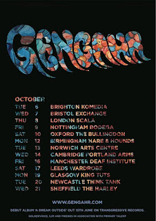


These are band posters all from the indie/indie pop genre. All of the posters apart from the ones for Chelou and Courtney Barnett use the album artwork in their posters and do not feature the band/artist themselves. Using album art on a tour poster is a convention of the indie genre and not so much of other genres like pop or grim which usually focus on the artists themselves and adhere to richard dyers star image theory. All of these posters follow the generic conventions of having the artist name in large bold font that is easy to see and this is often in the bands signature font. This helps create a sense of brand identity and helps the product work well across various media platforms. The posters also all have the date/dates of a performance or multiple tour destinations. Another convention is that they all have a small website address at the bottom of the poster, either directing the audience to a ticket website or the bands own website. As well as this some of the posters have the price of the tickets on them.
Elements of the posters that I would like to try myself
I really like how the gengahr poster uses a font which has been cut out from the bands album art work I think this maybe something that I would like to try in my own work however this is a skill that I would need to learn how to do in photoshop or InDesign. If this style does not look as visually pleasing as expected then I would like to try running the name of the band vertically as is done on the Courtney Barnett poster. This challenges conventions of most band posters but think it looks very effective and would be appropriate for the genre. However I will also follow many of the generic conventions of a band poster such as having the date, price of tickets, website and venue on my poster.


No comments:
Post a Comment